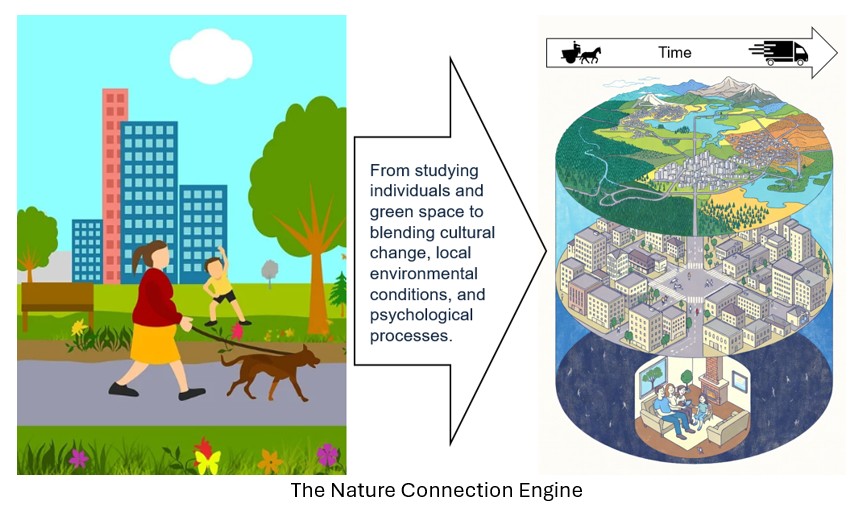
My latest research in the Journal of Environmental Psychology explores how everyday life conditions have shaped mental health discourse and prevalence over the last two centuries. Mental health difficulties have increased across many societies and this suggests that mental health is not just a condition of mind, but also a condition of life. It is shaped by a complex interplay of structural and cultural factors. Economics matter. Education matters. Urbanisation matters. So do technological change, social exclusion, and the physical environments in which people live. Over recent decades, psychology and public health have steadily widened their lens to recognise these broader determinants of mental health.
Yet despite this broadening of scope, one foundational aspect of human experience remains largely absent from how mental health is usually explained: the human–nature relationship. This omission is not trivial. For example, the American Psychiatric Association’s Task Force on the Social Determinants of Mental Health makes little reference to nature at all.
This matters as in this latest research across this long historical view, two foundations of good mental health stand out.
- The importance of economic conditions—reflected in how much cultural attention is given to issues of work, income, prosperity, and insecurity.
- A close relationship with the natural world—reflected in how much cultural attention is given to nature.
Together, these factors appear to explain long‑term mental health trends – a trebling since the 1950s and doubling since 1980 – more so than many of the determinants that are mentioned more often.
What did the study do?
The study took a long historical view, examining how often mental health‑related terms have been used in English‑language works over more than two centuries (1800–2020). Large‑scale word frequency data was used as a proxy for societal concern, stress, and broader mental health trends.
A carefully selected set of mental health‑related terms was compiled from five historical eras. Statistical techniques were used to ensure these terms reflected a coherent underlying concept, rather than shifts in language, fashion, or diagnostic systems. Each era was equally weighted so that no single period dominated the index, preserving long‑term comparability.
Is word frequency data a useful proxy for mental health prevalence?
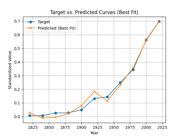
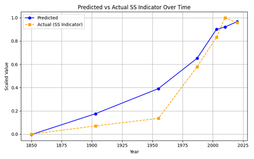
Language is not the same as prevalence, but it reflects reality. What societies talk and write about indicates topics that matter. These language trends were therefore tested against real‑world indicators—namely mental‑health‑related hospitalisation and social security records—and showed strong alignment across time, see the chart below.
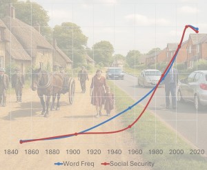
The use of mental health terminology matched actual prevalence well
The study reveals a marked and accelerating rise in cultural attention to mental health across two centuries, particularly from the mid‑20th century onward with a trebling since the 1950s and doubling since 1980. This pattern closely matches real‑world prevalence indicators such as mental health related social security claims. These results suggest that word use trends can serve as a reliable proxy for societal concern—and potentially for underlying prevalence—opening up new possibilities for tracking population mental health over time.
Which life conditions best explain the rise in references to mental health since 1800?
The core aim of the work was to test whether macro‑level life conditions, also measured using the word‑frequency approach, could explain the long‑term changes in mental health discourse.
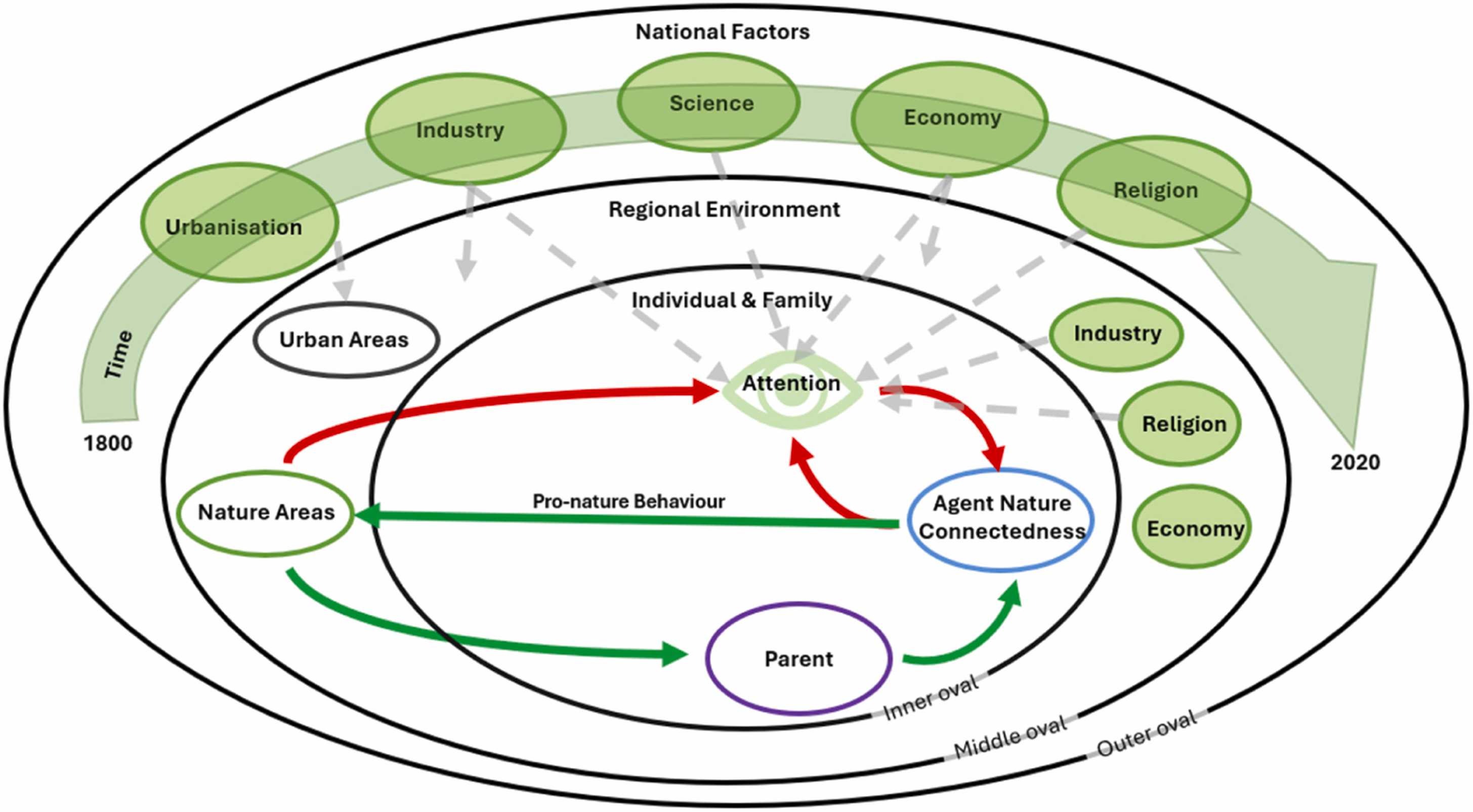
Eight factors were included: six established mental health determinants, plus human‑centred values and the human–nature relationship.
- Economic Environment, e.g. unemployment, capitalism, economy
- Urbanisation, e.g. urban, cityscape, housing
- Technology, e.g. computing, digital, social media, data
- Environmental Stressors, e.g. pollution, landslide, global warming
- Social Equity, e.g. exclusion, gender, discrimination
- Education, e.g. university, curriculum, literacy
- Human-Centred Values, e.g. autonomy, ethics, individualism,
- Human–Nature Relationship, e.g. bud, dew, mosses, mountain
Discourse about everyday life conditions explains mental health discourse well.
A predictive modelling approach was used to see how the eight factors best combine to fit the mental health trend. The analysis showed that long‑term changes in mental health discourse can be explained by a combination of socio‑economic macro‑level factors.
Discourse about everyday life conditions explains mental health discourse well. After several validation tests two factors stood out as contributing most:
- The economic environment, reflecting the degree to which economic conditions such as work, income, growth, and employment are salient in everyday concerns
- The human–nature relationship, reflecting whether nature remains part of everyday cultural experience
The economic environment emerged as the strongest positive contributor to lower mental health discourse, consistent with extensive literature linking economic and employment to mental health outcomes.
Notably, the human–nature relationship showed the same protective pattern: when nature featured in our lives, mental health discourse was lower.
Urbanisation and technology showed substantial negative weights, meaning that as these factors grew, mental health discourse also increased. This aligns with evidence linking urban living to social isolation and the growing recognition of digital‑era stressors.
Human‑centred values, including individualism and autonomy, also showed negative associations with mental health discourse, echoing concerns about cultural disconnection and emotional strain in highly individualistic societies. Social equity and education contributed positively, but more modestly.
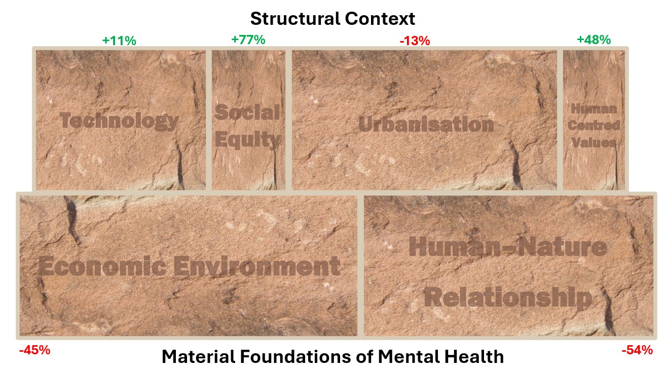
The six factors with the highest weightings are shown in the figure below, with the stone size proportional to the weightings found in the analysis.
Do the foundational factors get the most attention?
The economic environment and human-nature relationship stood out as foundational factors, but the results show that it is trends in attention to the other six determinants that have been increasing most in recent decades.
While cultural attention to technology (+11%), education (+66%), social equity (+77%), environmental stressors (+47%), human-centred values (+48%) has grown since the 1980s, attention to the economic environment has fallen (-45%), alongside urbanisation (-13%), while the human-nature relationship remains around half of its historical highs.

Attention to other mental health determinants has overtaken foundational factors in recent decades (stone size represents analysis weightings).
References to education, human‑centred values, and social equity overtook economic discourse in the 1990s, with urbanisation, technology, and environmental stressors doing so in the 2000s. Importantly, this fall in economic language does not mean the economy has been “sorted.” Rather, it indicates a declining focus on economic conditions in everyday cultural attention. The economy has not ceased to matter; it has receded into the background while attention to other topics has increased.
These shifts suggest that more visible or contemporary concerns, for example “screen time”, may have come to dominate attention, potentially overshadowing the foundational conditions of mental health. These determinants can dominate attention, while unresolved economic conditions and long‑term losses in nature connection continued to shape mental wellbeing.
It is also notable that Western nations, which exhibit the steepest rises in mental health difficulties, tend to be trending to weaker relationships with nature, a pattern also linked to economic priorities and individualistic values – mental health and the human-nature relationship share foundational factors.
Can the use of non-mental health words predict real world mental health prevalence?
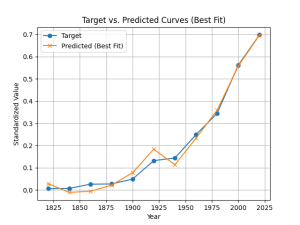
The next step was to explore whether the use of non‑mental‑health words—such as those relating to the economy, urban living, technology, environmental stress, social equity, education, human‑centred values, and nature—can explain real‑world mental health prevalence? The answer is yes, and with surprising accuracy.
When the model was tested against long‑running indicators such as mental‑health related hospitalisation and social security records, it tracked real‑world prevalence patterns across more than a century of data quite well, see below.

Use of non-mental health words can predict mental health prevalence.
Importantly, this predictive power was achieved without using mental health terms themselves, showing that the use of language about broader life conditions carries a strong signal about population mental health.
This matters because it suggests mental health trends are not solely the result of changing awareness or diagnostic practices. Instead, they are closely tied to underlying social, economic, and environmental conditions that shape everyday life. In that sense, mental health discourse acts as a readable signal of deeper structural pressures and protections.
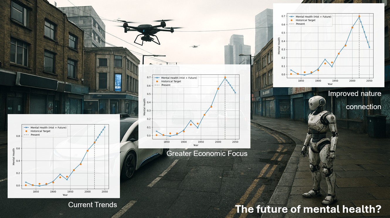
What does this mean for the future of mental health?
By extrapolating recent trends in factors such as the economic environment, urbanisation, and technology, the model produced future scenarios suggesting that mental health burden is likely to continue increasing if current patterns persist. However, alternative scenarios told a markedly different story. When the model simulated a restoration of the human–nature relationship—or a renewed focus on economic conditions—predicted mental health discourse fell substantially. Of the scenarios tested, restoring cultural attention to nature produced the largest reduction, suggesting a powerful and under‑recognised lever for population mental wellbeing.
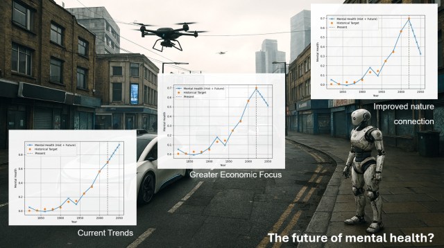
Future scenarios of mental health
These future scenarios reinforce a central message of the study: mental health trajectories are not fixed, but depend heavily on whether societies strengthen or continue to erode the foundational conditions.
What are the implications of the results?
The results point towards some interesting conclusions. In addition to focusing on individuals’ mental health, two structural foundations stand out:
- A focus on the economic environment as this underpins the ability to materially provide for oneself.
- Creating a culture of meaningful engagement with the natural world.
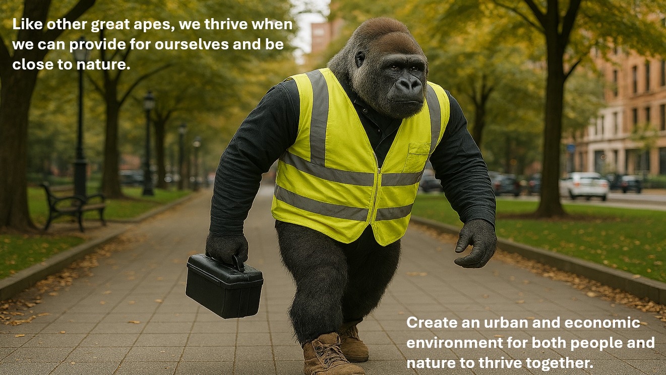
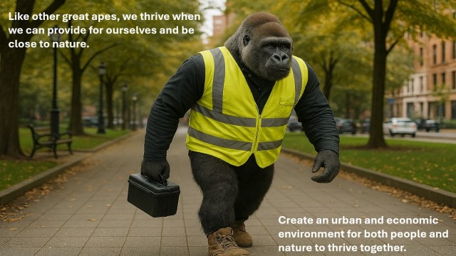
Sometimes simple evolutionary accounts provide a useful perspective. Humans are part of the natural world and like other great apes, there are core material foundations to living well. The opportunity to provide for ourselves in our natural habitat is fundamental. Like other great apes we thrive when we can provide for ourselves and be close to nature.
This perspective cuts through some conceptual clutter as lists of influences on mental health continue to grow. Of course, these factors matter. But many operate within constraints set by deeper conditions. This research suggests that good mental health is built on material foundations. The context of our lives can be seen to sit on top of these foundations. This does not deny complexity—it helps organise it.
From a policy perspective, the long view of this research highlights the need to ensure that current ‘hot topics’ do not overshadow the fundamentals. There is only a certain amount of bandwidth and policy should ensure it considers the most important levers, rather than focus overly on present day context. And scenario modelling suggests that restoring everyday engagement with nature, and re‑centring economic conditions as shared foundations of life, could meaningfully alter future trajectories.
This work also highlights how language use mirrors shifts in societal stress and wellbeing. The approach also points to practical opportunities: language trends can offer early signals of rising mental health burden.
Finally, the shared structural drivers behind both the decline in the human–nature relationship and the rise in mental health difficulties—especially in Western nations should also be considered. These include economic priorities, urbanisation, technological change, and increasingly human‑centred value systems.
The findings suggest that unifying both human and nature’s wellbeing depends on creating economic and urban environments that allow people and nature to thrive together—reinforcing the need for integrated approaches that bridge mental health, social, and ecological policy.
Richardson, M. (2026). Nature, economy and mental health: Predictive insights from historical language patterns. Journal of Environmental Psychology, 112, 103078. https://doi.org/10.1016/j.jenvp.2026.103078